Blog
Quilt Color Theory – How to Choose the Perfect Palette
Hi!
We’ve had requests for a look at quilt color theory again, and so this week we’d like to share a few pointers with ideas and examples for how to apply this information in your own quilt making decisions.
Choosing the right color palette for your quilt can feel like a daunting task, but it doesn’t have to be!
Whether you’re drawn to bold and vibrant hues or soft and subtle tones, understanding a little bit about color theory can make your decisions easier and your designs even more stunning. From mastering the color wheel to playing with value and texture, these tips will help you create quilts that are not only beautiful but also uniquely yours.
The Color Wheel: Your Quilting BFF
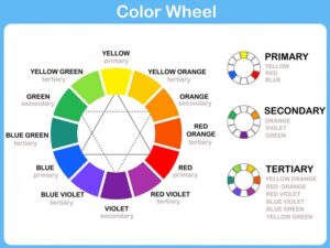
Let’s start with the color wheel. We’ve all seen it before, but how do you use it when trying to decide on colors for your quilt?
Well, it’s your go-to tool for understanding color theory and how colors work together. The wheel is made up of primary colors (red, yellow, blue), secondary colors (created by mixing primaries), and tertiary colors (a mix of primary and secondary hues). Use the wheel to guide your choices when planning your quilt palette. For instance, if you’re working on a traditional design, a primary color scheme can add timeless charm. If you’re feeling adventurous, dip into tertiary colors for a fresh, modern vibe.
Complementary Colors: Opposites Attract
Complementary colors are directly opposite each other on the wheel—think red and green or blue and orange. These combos create vibrant, high-contrast effects that can make certain parts of your quilt pop.
A Christmas quilt, for example, often relies on the classic red-and-green pairing. The trick is to balance these opposites. Instead of equal amounts, use one as the dominant color and the other as an accent for a bold but harmonious result.
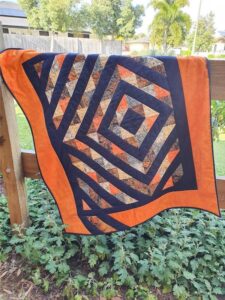
(Image from https://patchworkquiltmaker.com.au/shop/radiance/ )
Analogous Colors: Match Made in Heaven
If you’re after a quilt with a soothing, harmonious vibe, go for analogous colors. These are neighbors on the color wheel, like blue, teal, and green.
This type of palette is perfect for quilts meant to evoke calm, such as a baby quilt or a bedspread for a restful retreat. To keep it interesting, vary the shades and tints within your analogous scheme—a mix of light and dark fabrics adds depth while staying cohesive.
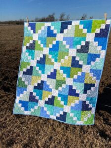
(Image from https://www.etsy.com/uk/listing/1163483442/green-blue-handmade-baby-toddler-or-kids )
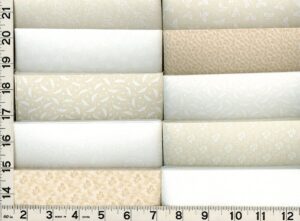
Understanding Color Value: Light, Medium, Dark
Value is the unsung hero of color theory, and it’s a game-changer for quilting. The value refers to the lightness or darkness of a color, and it’s what helps your quilt design come to life.
When planning your quilt, include a mix of light, medium, and dark fabrics to create depth and contrast. Try squinting at your fabrics or taking a black-and-white photo to check their value—it’s an easy trick to see how they’ll play together in your design.
(Image from https://sweetbriarsisters.com/blog/color-value-can-improve-quilting/ (with a great article on this topic).)
Mood and Emotion in Color
Colors tell stories and evoke emotions, making them a powerful tool in quilting.
Cool tones like blues and greens are calming and serene, making them ideal for a tranquil lap quilt. On the flip side, warm hues like reds, yellows, and oranges bring energy and excitement, perfect for statement pieces or cheerful wall hangings.
When planning your palette, think about the story or mood you want your quilt to convey—this will guide your color choices.
Fabric Prints and Textures: It’s Not Just About the Color
Color theory is just one piece of the puzzle; the prints and textures of your fabrics play a huge role in how your quilt comes together.
A bold geometric print might dominate a design, while a subtle tone-on-tone fabric can act as a neutral.
Don’t be afraid to mix scales—pairing large prints with small ones creates visual interest. Texture matters too; solids, batiks, and textured cottons reflect light differently, altering the perception of color in your quilt.
(Image from eBay)
Lighting Matters: Test Before You Commit
Have you ever picked out fabrics at the store, only to find they look completely different at home?
That’s because lighting plays a huge role in how colors appear. Natural daylight shows colors in their truest form, while artificial light can add warm or cool tones.
Always audition your fabrics in the space where the quilt will be used (if possible), and under a range of different lighting conditions. A portable design wall or even laying fabrics out on your sewing table can help you see how they work together.
Creating a Focal Point with Color
Every quilt needs a focal point, and color is an easy way to achieve it.
Use a bold or contrasting color to draw attention to a specific area of your design. For instance, in a star block quilt, a bright yellow center can become the star’s shining heart.
When planning your layout, think about where you want the eye to go and use color strategically to guide the viewer’s attention.
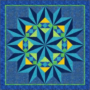
(Image from https://www.fabricaddict.net/shop/c/p/Crystalized-quilt-pattern-x61624984.htm )
Rainbow Quilts: When You Can’t Pick Just One
Sometimes, the best solution is to use ALL the colors!!!
Rainbow quilts are a joyful celebration of variety, making them perfect for scrap-busting projects or playful gifts.
To keep things cohesive, focus on balancing the values and spacing your colors evenly throughout the design. Whether you’re working with solids, prints, or a mix of both, a rainbow quilt is guaranteed to brighten any space.
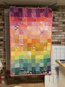
(Image from https://www.reddit.com/r/quilting/comments/1f1h57m/color_gradient_quilt/?rdt=46128 )
And Finally – Trust Your Gut: Quilt with Confidence
While color theory offers fantastic guidelines, don’t forget the golden rule of quilting: trust your instincts.
If a combination makes you happy, it’s the right choice for your quilt.
Quilting is all about joy and self-expression, so let your personal style shine through. Whether you’re sticking to the rules or breaking them, have fun with your palette and create something that feels uniquely you.
Challenge yourself this week – have a play with colors you don’t usually use, and see what you can create that’s new for you, and let us know how you go!
Enjoy!